Notes from shipping puzzlywords.com
A client asked me to build a landing that didn't look AI-generated — even though almost every pixel went through an LLM.
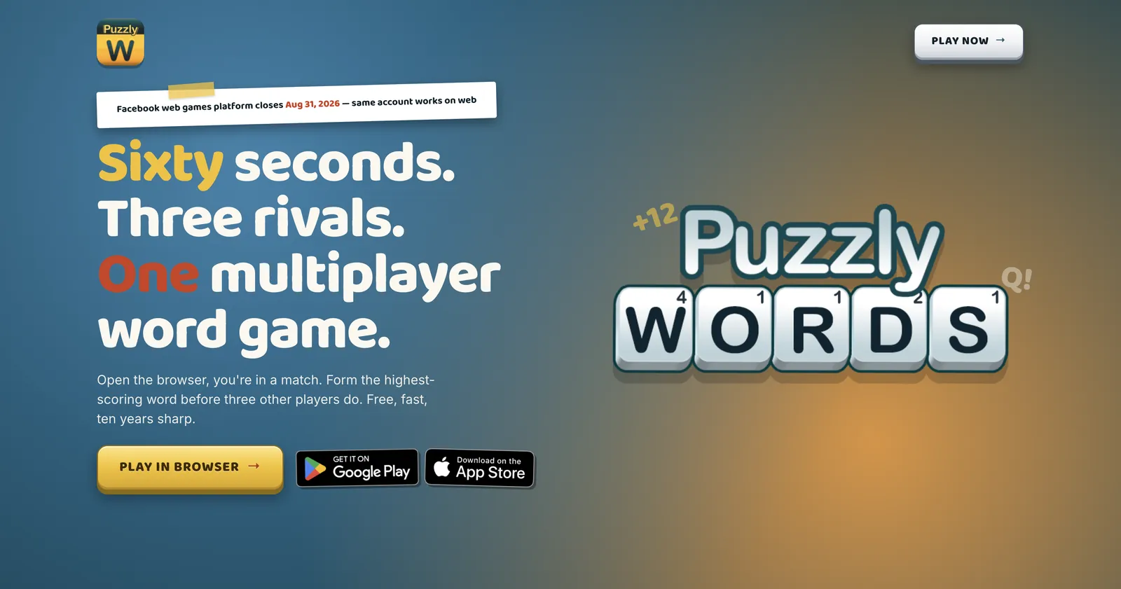
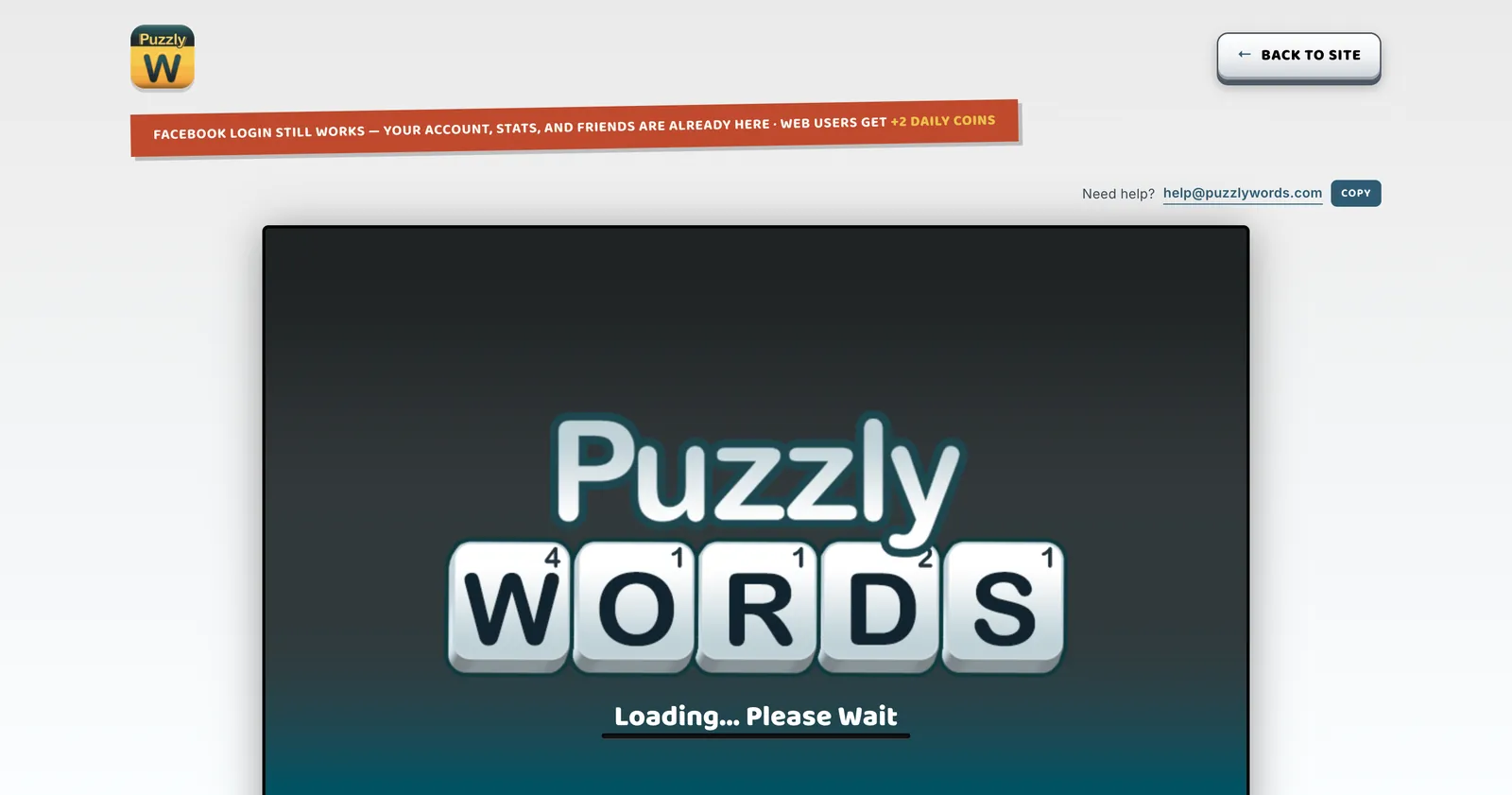
Facebook is killing their web games platform, so puzzlywords.com needed a real home before August. I shipped it last month. Here's the actual process I used, including the parts that didn't work.
What shipped
puzzlywords.com
A Facebook web game ported to a standalone domain before Meta closes the platform on 2026-08-31. The brief: don't look AI-generated.
What slop actually is
It's not the individual elements that make a page read as AI — it's the combination of them showing up together.
01
Combinations, not elements
Radial blur isn't slop. Glass-morphism isn't slop. Bento isn't slop. Each is fine when chosen on purpose. What reads as AI-default is five-to-ten of them defaulted in together.
02
Taste is still your job
An LLM produces variants, runs perf passes, writes schema. It can't tell you which variant is right — only which is statistically common. That part is you. Skip the picking and you ship the average.
03
Cheap raises the bar
Anyone can ship a serviceable landing in a day. Serviceable is the new floor, not the ceiling. Differentiation is the specific calls only you can make.
The smell list
Any one of these patterns is fine on its own — three of them together is when the page starts to smell.
None of these patterns are wrong on their own. When three or more show up together with no reason, the page reads as default.
The method
The trick is to generate widely and then cut aggressively, in three rounds.
Subtraction beats creation here. The LLM produces variants in minutes; the work is figuring out which ones to throw away.
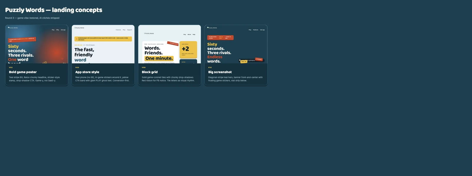
10 directions → 4
Vary the direction, not the polish. Minimal, bold, app-store, dark-tech, magazine, brutalist, migration-first, bento, arcade, screenshot-hero. The client typed a few numbers to kill in under a minute.
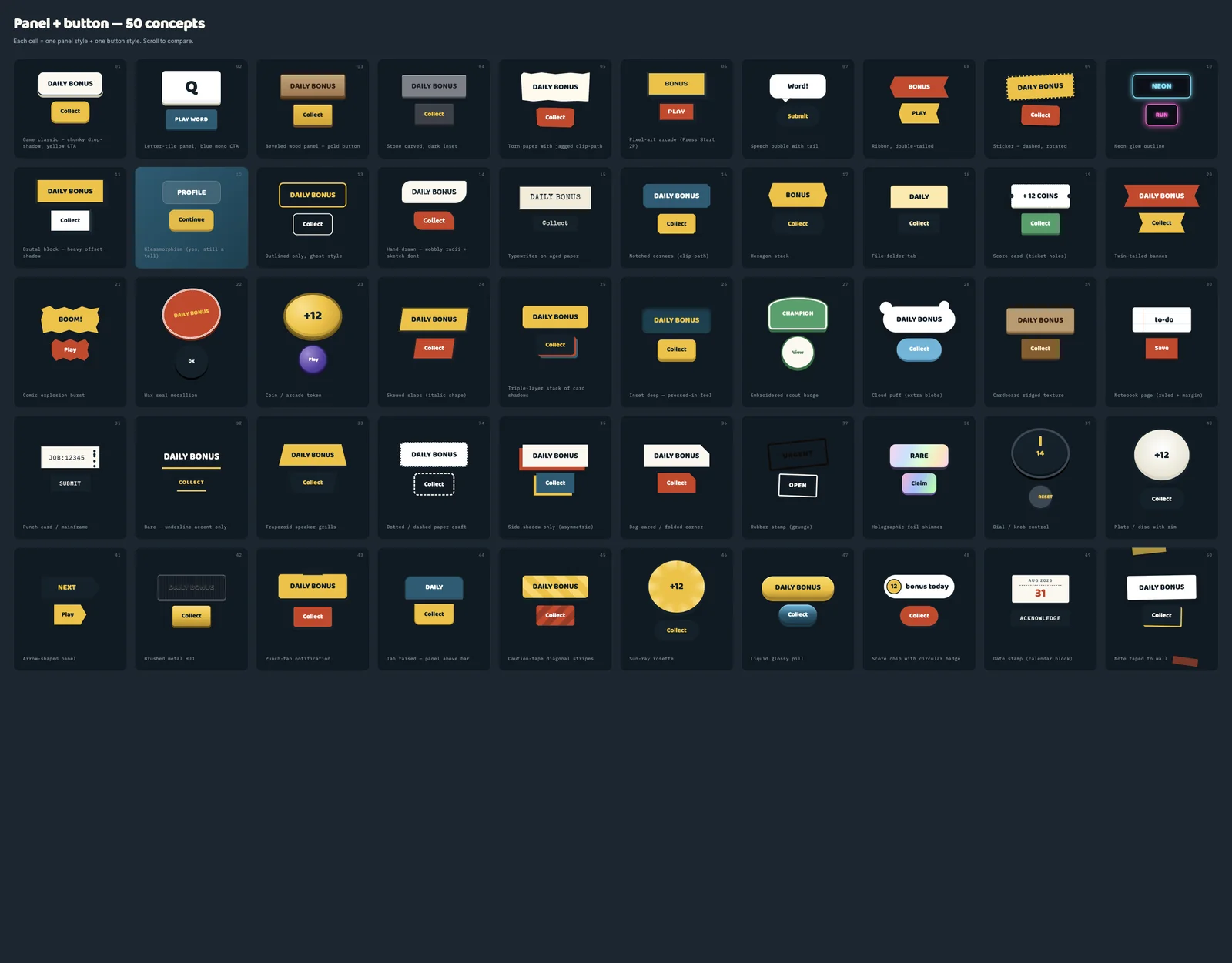
50 panels → 10
With 4 layouts surviving, pick the visual language, not the layout. One grid of 50 micro-experiments: tile, torn paper, ribbon, hexagon, ticket, banner, tape, neon, brutalist. Client picks ~10.
10 skins → 1
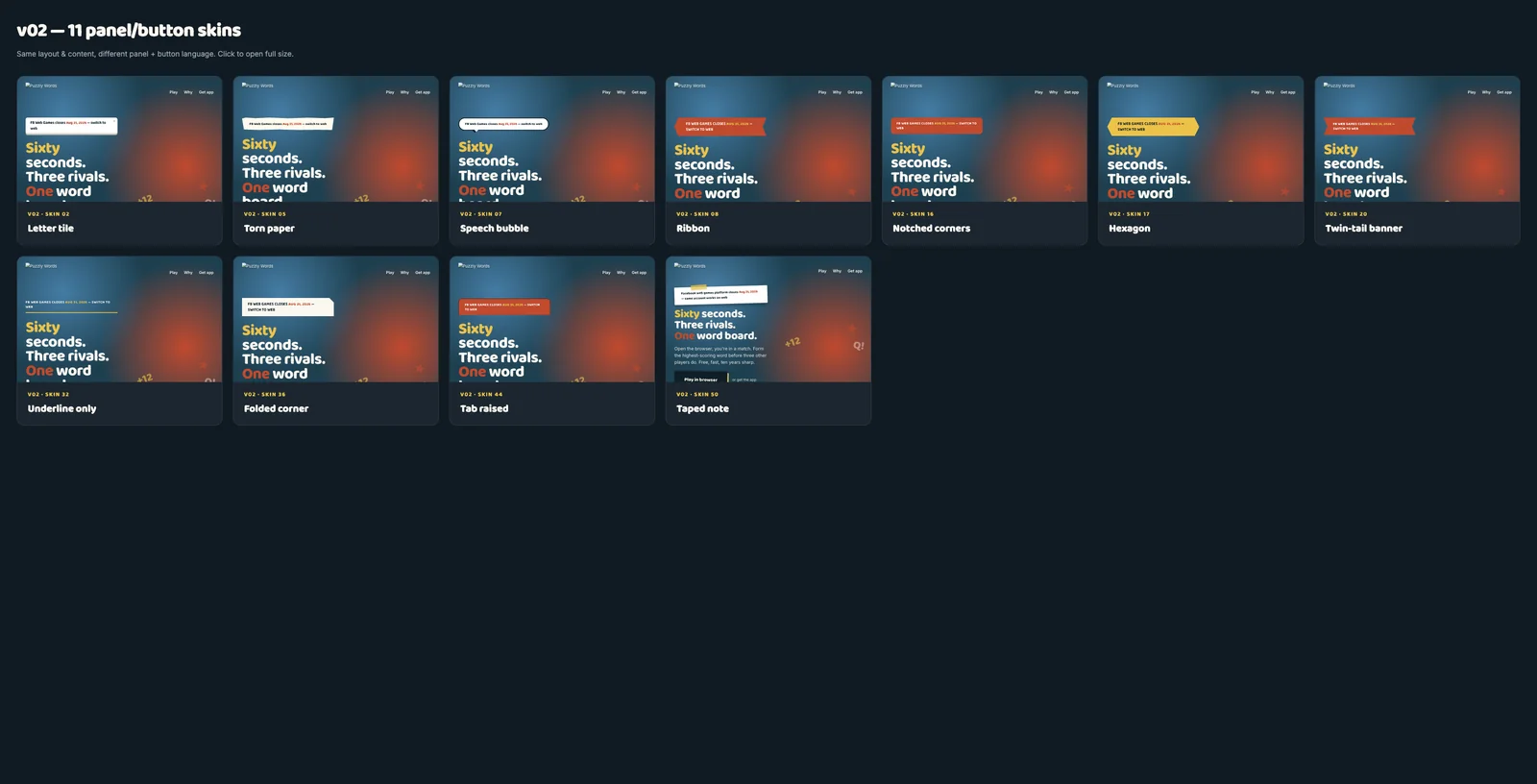
Take the winning layout. Apply each picked style as a skin — same content, same structure, only the panel and button language changes. One winner.
Round 1 — four directions surviving after the first cull
Round 2 — 50 panel and button experiments in one pass
Round 3 — 11 skins on the same layout — same content, only the panel language changes
Voice is its own round
Headlines have the same blast radius as design.
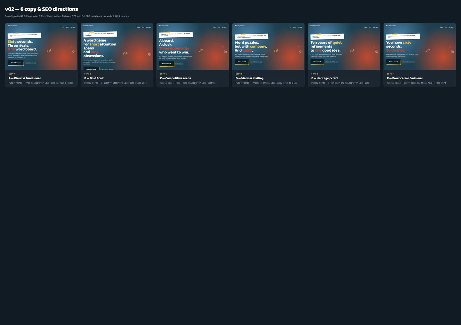
After the visual is locked, run another 4–6 directions for just the headline, notice, blurbs, and SEO meta. Pick one.
What shipped
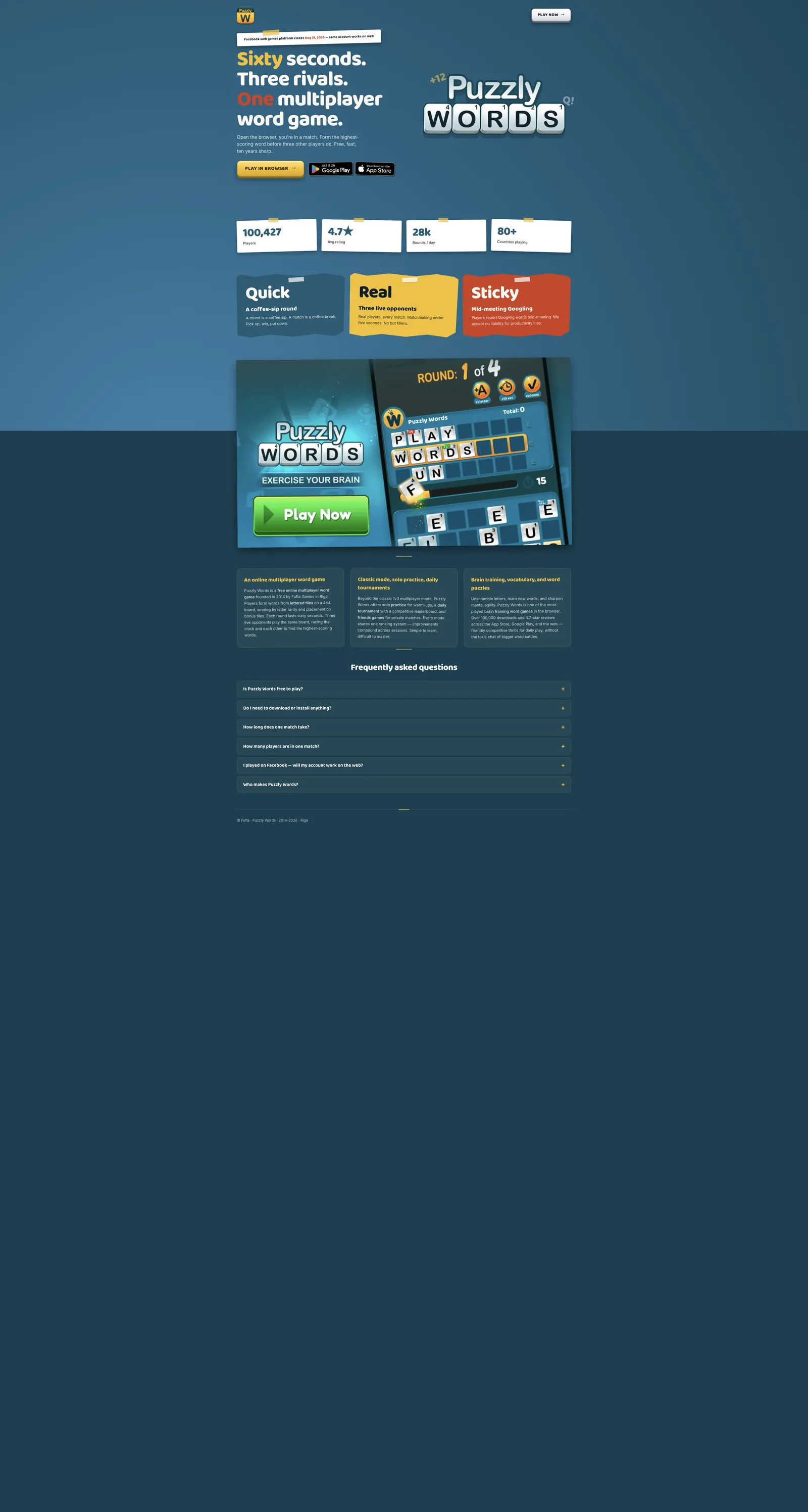
Here's the whole page.
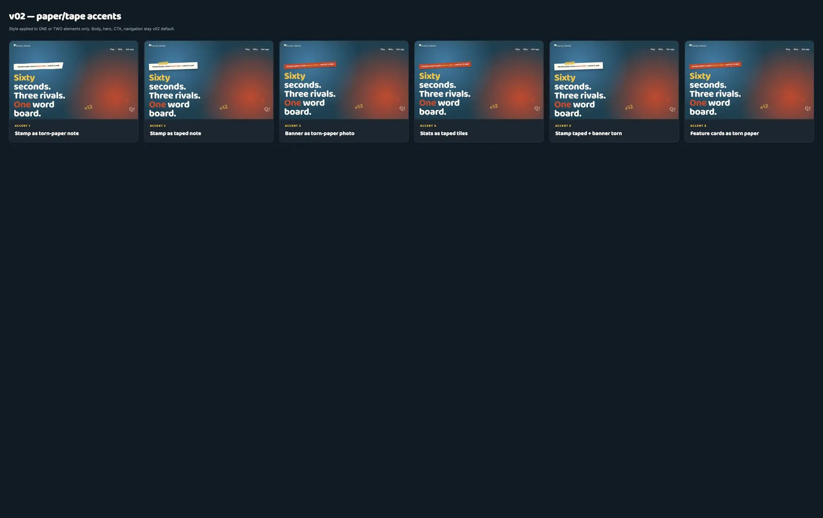
Top to bottom. The torn-paper style only shows up on the feature cards — everything else stays clean. That's the whole trick: pick one move, apply it to one or two elements, leave the rest alone.
If you skip the picking, what you end up shipping is just the average of the variants.
The average is exactly what slop looks like. Every elimination round here is a human saying that one, not that one. The AI is the production line. You're the art director.
10 → 1
directions to a chosen layout
50 → 1
panel concepts to a visual language
1 day
from first variants to shipped